Verve Super Rebrand
Verve Super Rebrand
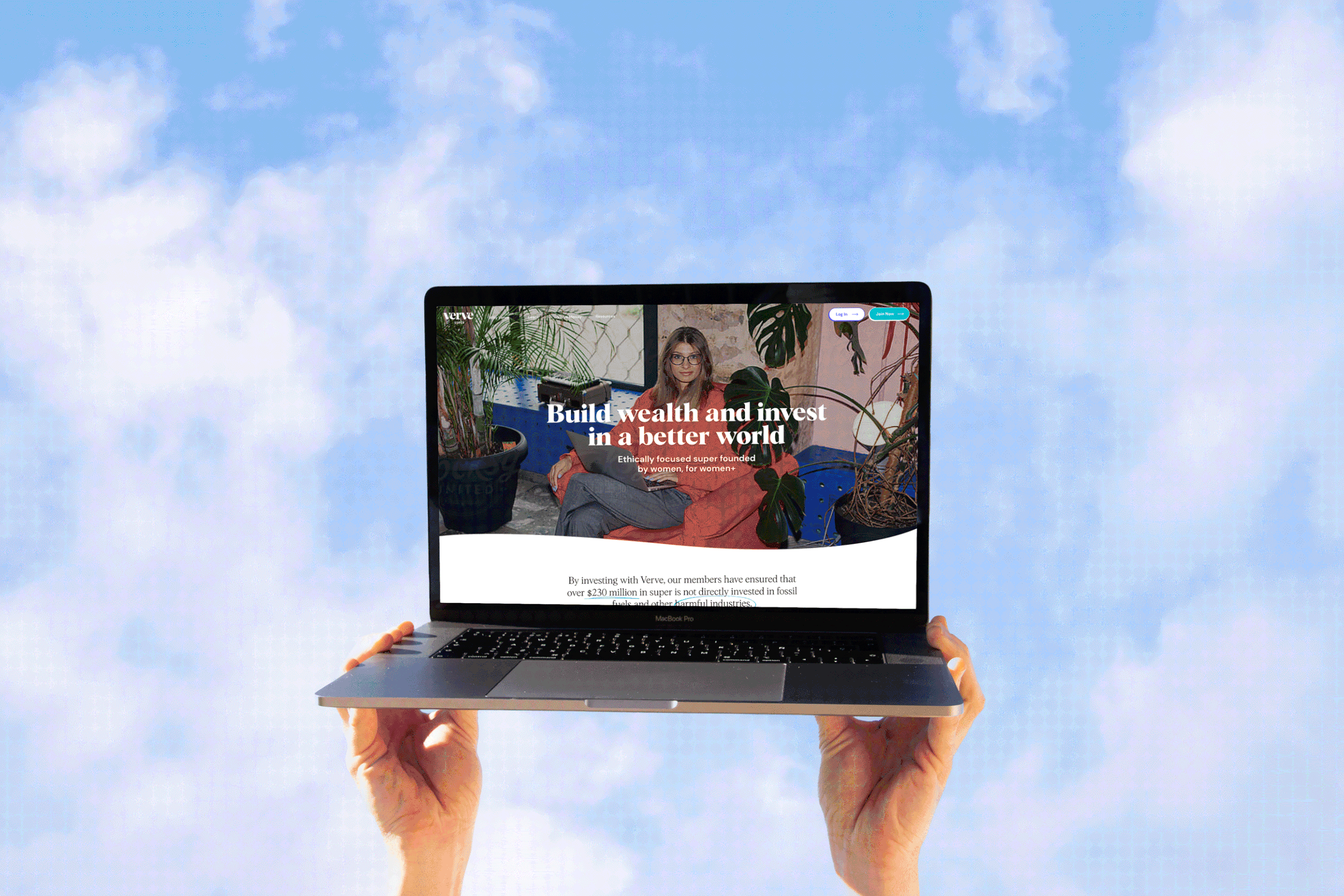
I worked with Verve Super throughout 2023 to revamp and refresh their brand. The brand is a female led Superannuation brand focused on financial education and advocacy for Women+. They needed a fresh take that felt inclusive, uplifting and ahead of the curve in the financial industry.
Communal Joy
This 2023 version of the Verve logo has thoughtfully reduced the prominent Capital V to a lowercase letter, resulting in a more balanced and harmonious logo design. The intentional repetition of the ‘ve’ and the streamlined one-line tightness not only better reflects Verve’s commitment to its equal access mission but also creates an overall sense of calm confidence. This refined approach allows the logo to convey a feeling of inclusivity and modernity, further enhancing the brand’s identity in a subtle yet impactful manner.

Visual Language


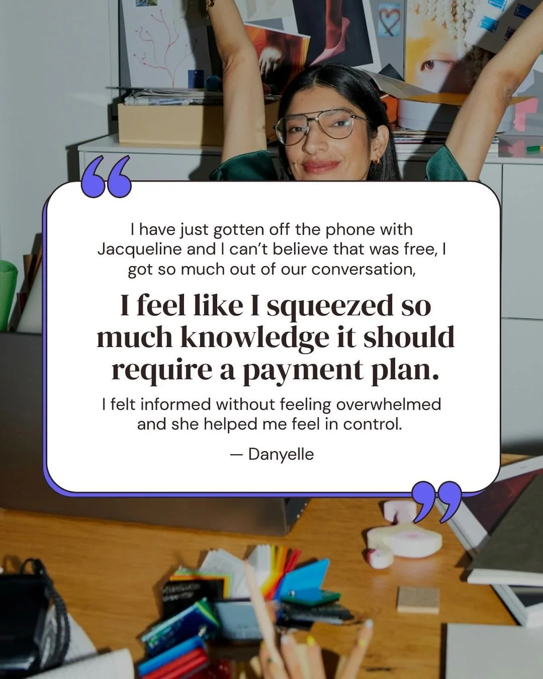
Verve is celebrating community and connection expressed through imaginative storytelling. The design emphasizes confident and composed individuals engaged in joyful interactions, effectively portraying the diverse tapestry of lives that Verve Super embodies. A rich representation across age, culture, ability, profession, identity, and ethnicity is ensured, integrating diversity deeply into the narrative rather than as a superficial gesture.
Photography utilizes high contrast to emulate vibrant flash effects, balancing brightness with bold, defined shadows. Each image is crafted with brand colors in mind, particularly drawing on the secondary palette to foster a cohesive visual experience. The playful, hand-drawn style of the icons exudes boldness and accessibility, inviting engagement and harmonizing with contextual headers and text. Through this rebrand, Verve aims to cultivate an inviting atmosphere that resonates with the community while reflecting the dynamic world around us.